Indian Hill House
Addition, Remodeling, + Curb Appeal - Dublin, Ohio
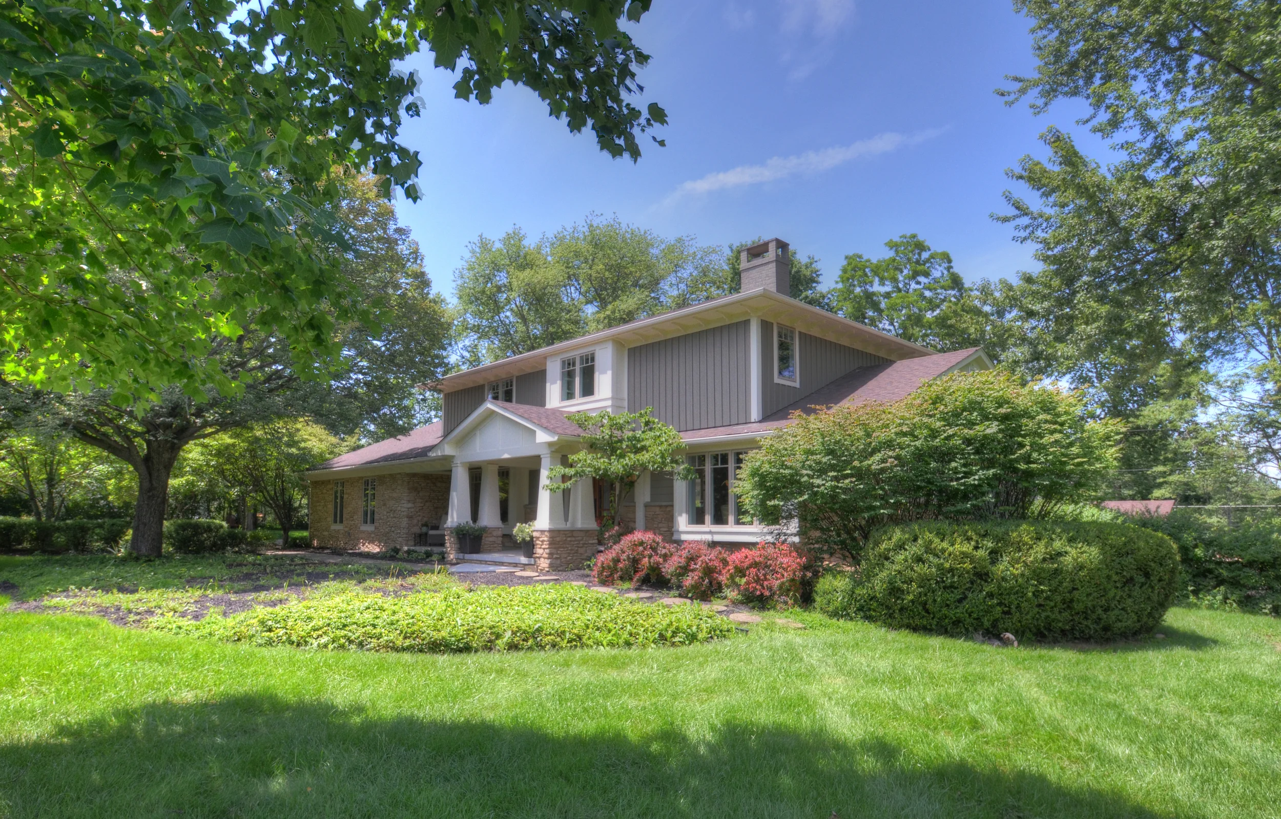
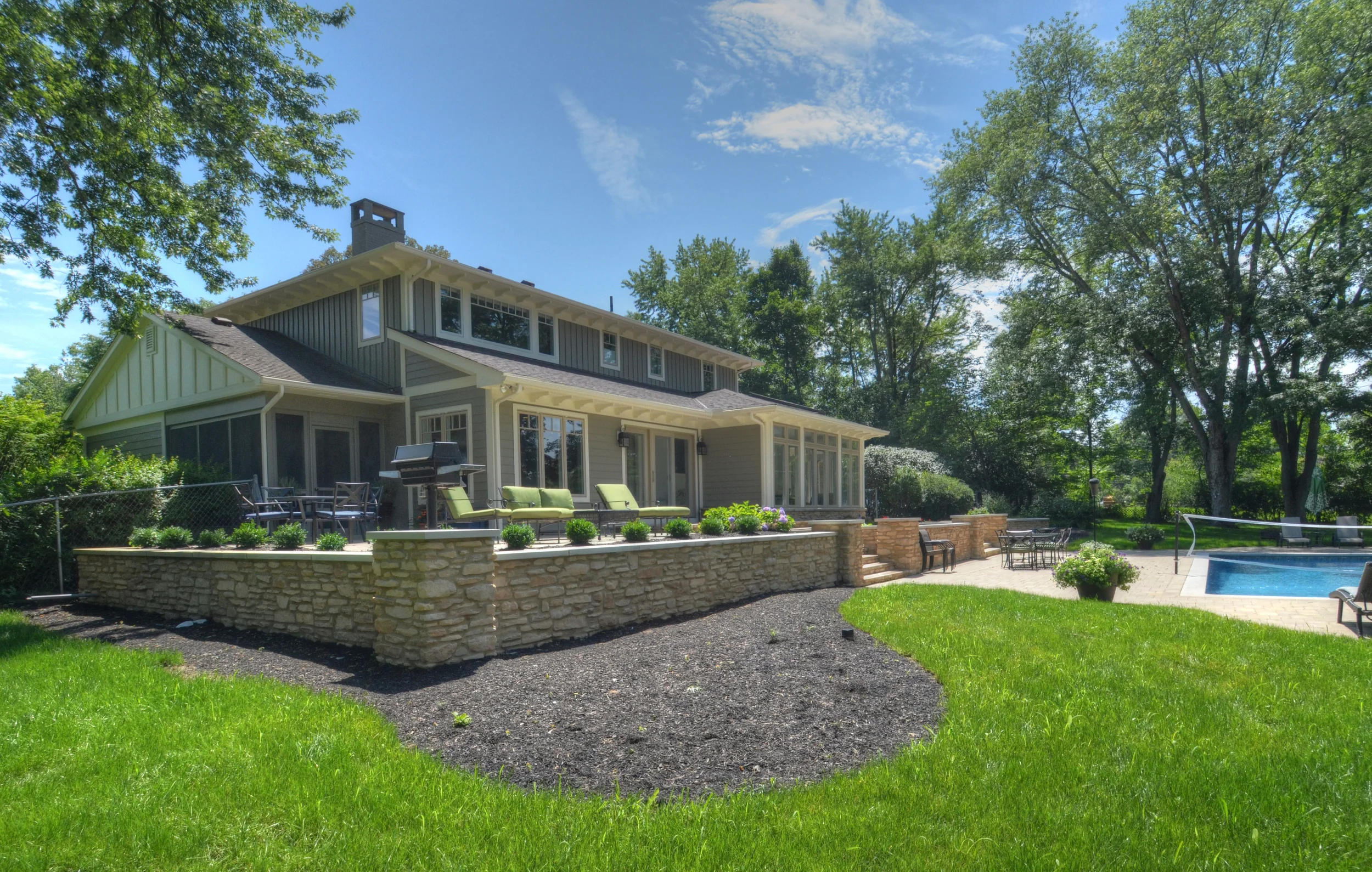
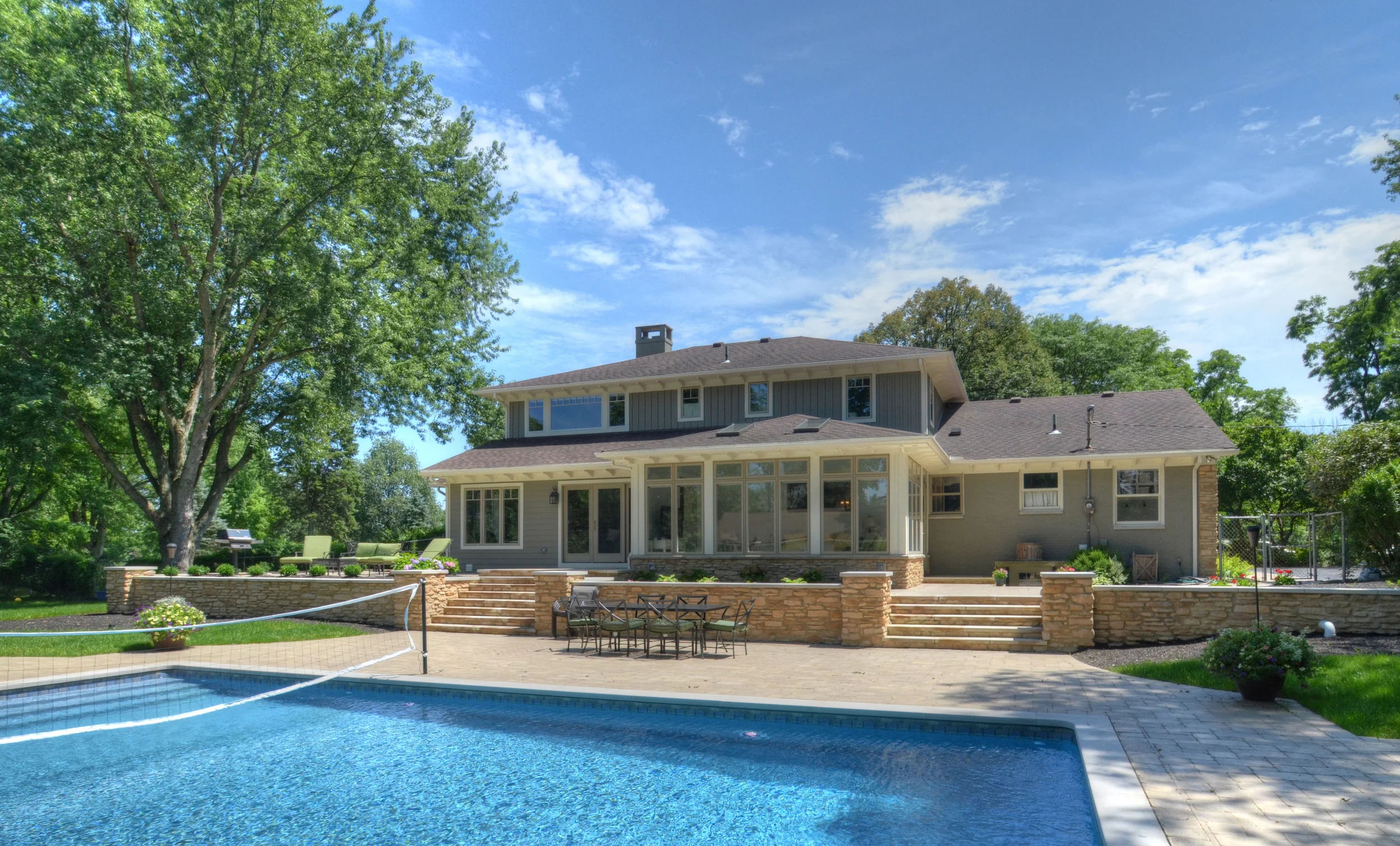
This home is such a great example of how an older (Typical 1960's-1990's), plain, suburban house can become open, modern, and unexpected. Let's start with the exterior!
...and the best way to do that is to click HERE for the "Before" shot.
Click HERE for the "Before" shot of the rear of the home.
The Owners of this home really love the Craftsman style and wanted to incorporate that on the exterior of their home. We added all new horizontal siding above a new raised stone water table, vertical siding on the second floor, and various different trim details around the house, in the gables, and under the eaves, to create a much more exciting and character-rich exterior.
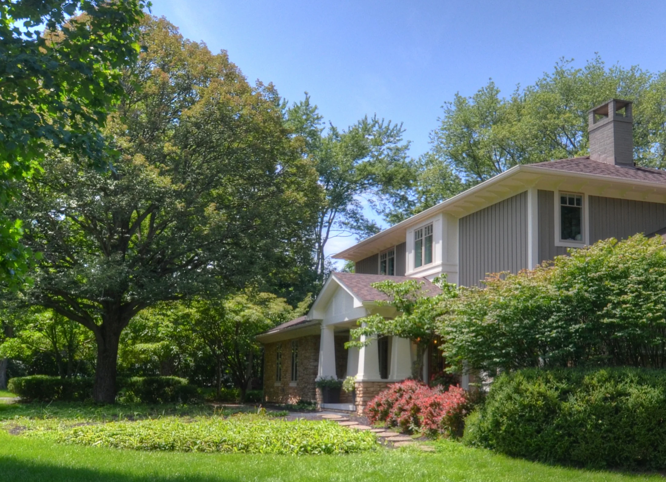
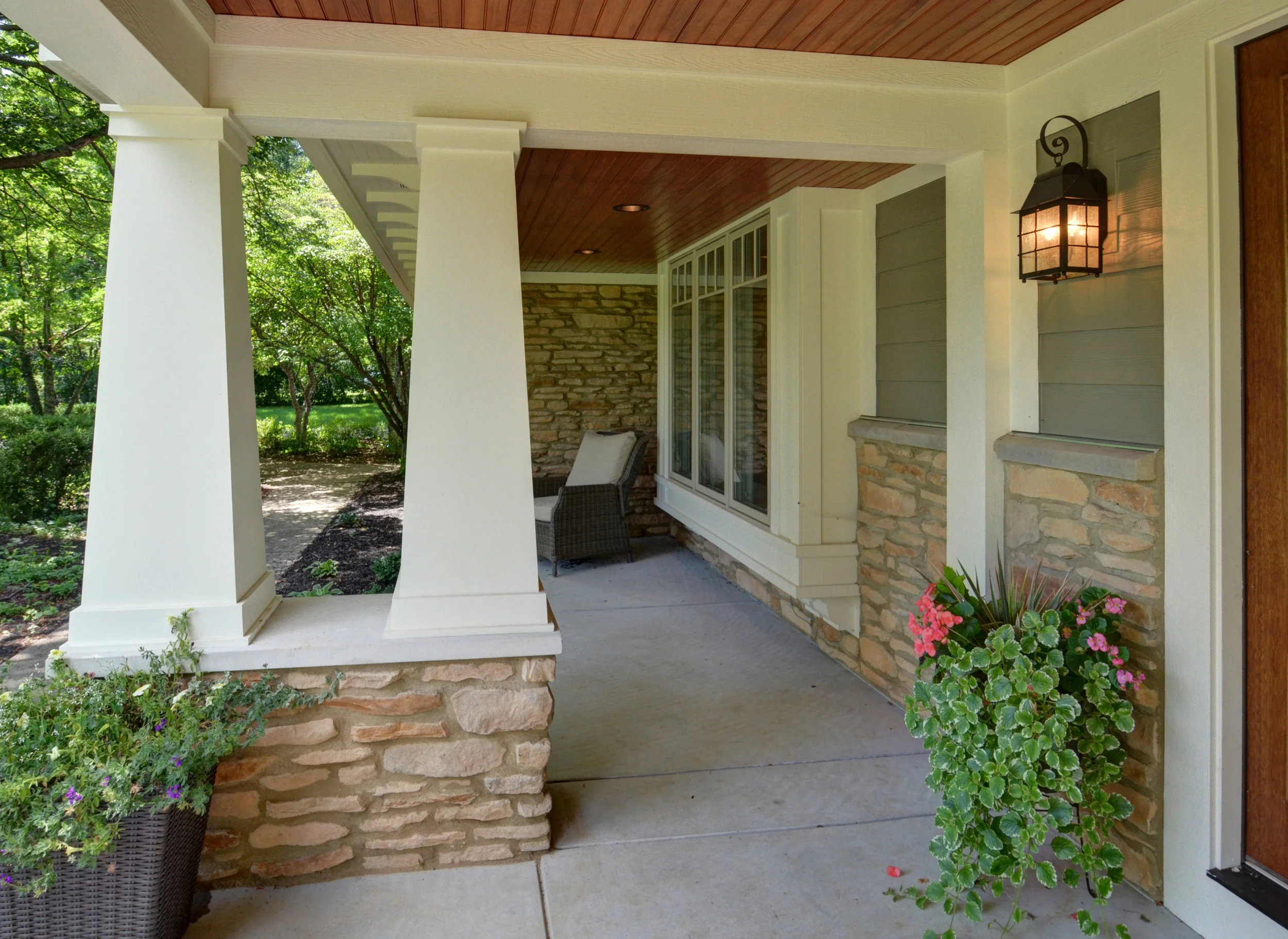
All of the existing windows were changed out for ones that are more stylistically appropriate. A front porch addition with large, Craftsman columns was added onto the existing porch to add detail near the front door and create a focal point.
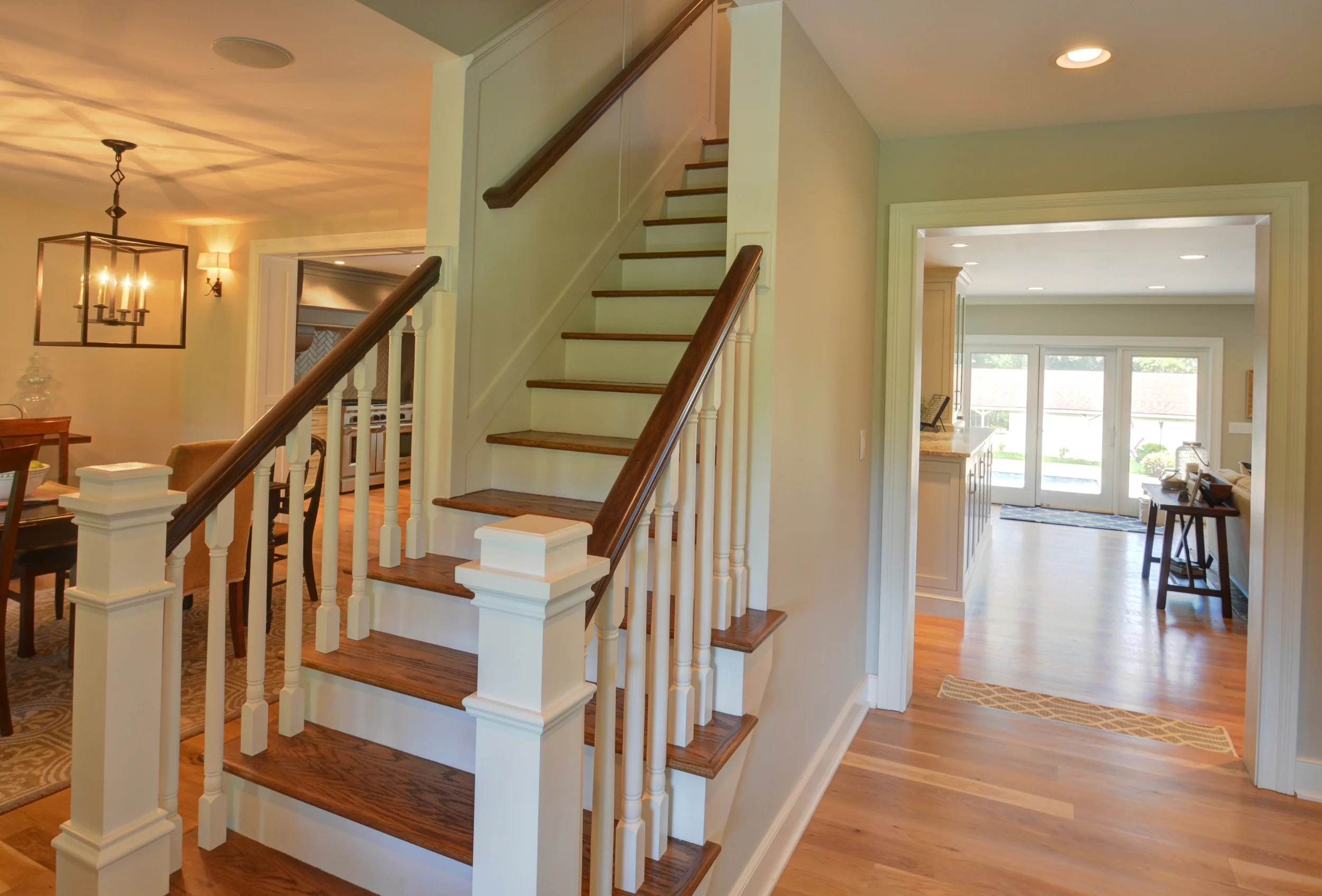
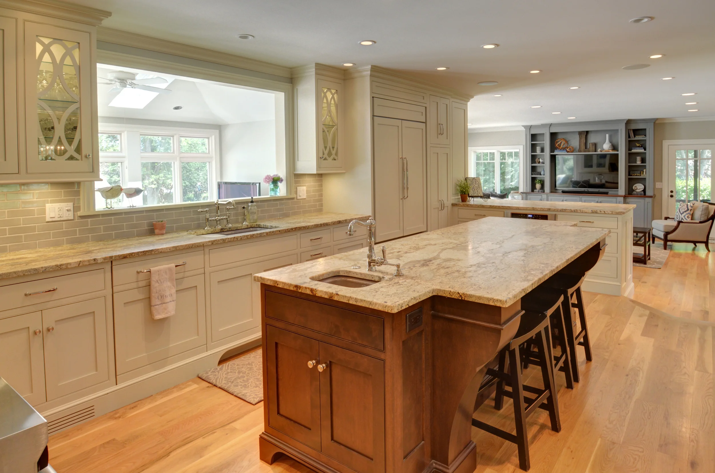
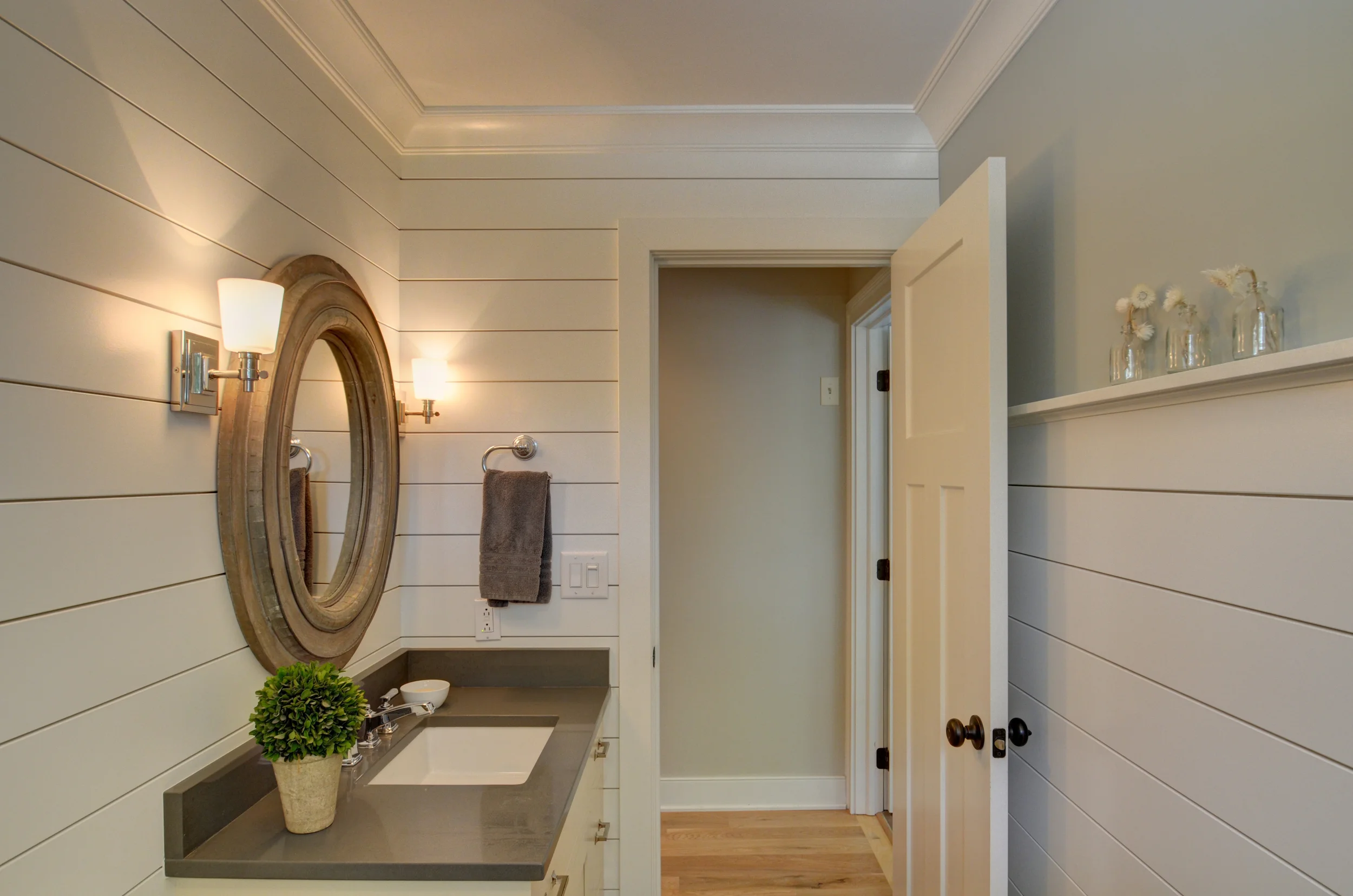
As with most homes of this era, you enter into a foyer with a stair - living room and dining room to each side. We kept each of these spaces where they were, but we opened up the walls as much as possible.
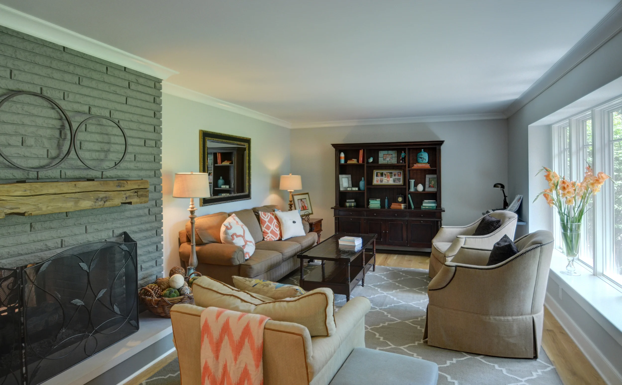
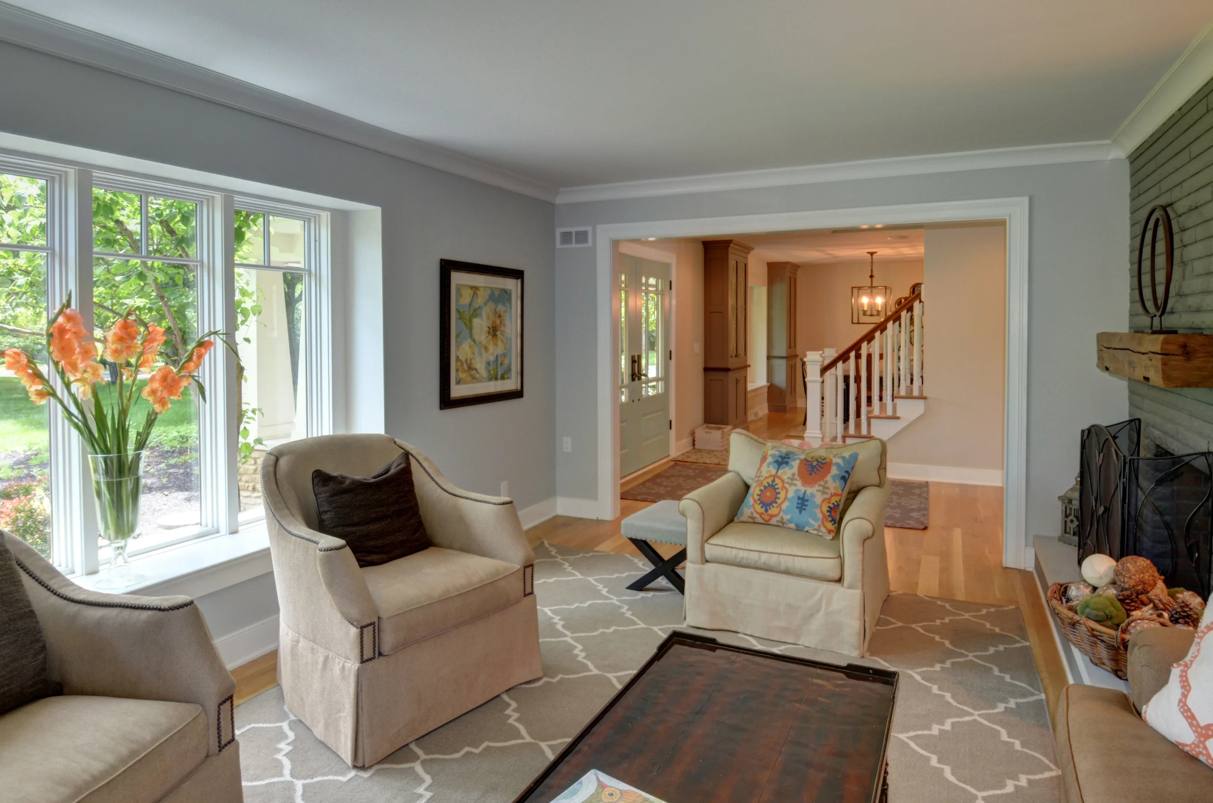
The opening room the living room to the foyer is wide open now; making this space more conducive for using every day, entertaining, and wanting to spend time in! At the same time, we kept a cased opening between the two spaces to help keep the definition between entry and living room.
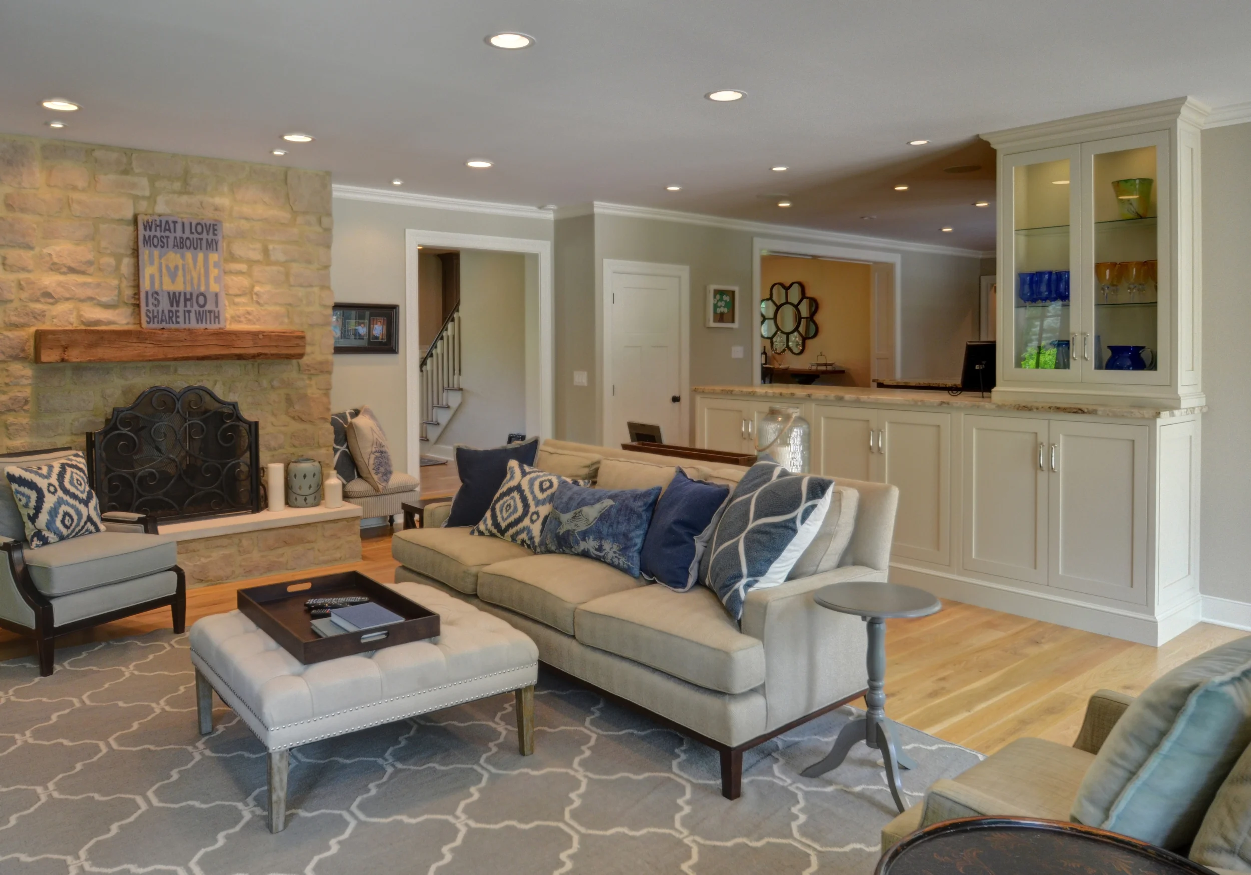
This isn't your Grandma's plastic covered white couch in this room, folks! ...this is meant to be used AND beautiful.
Click HERE for the "Before" shot.
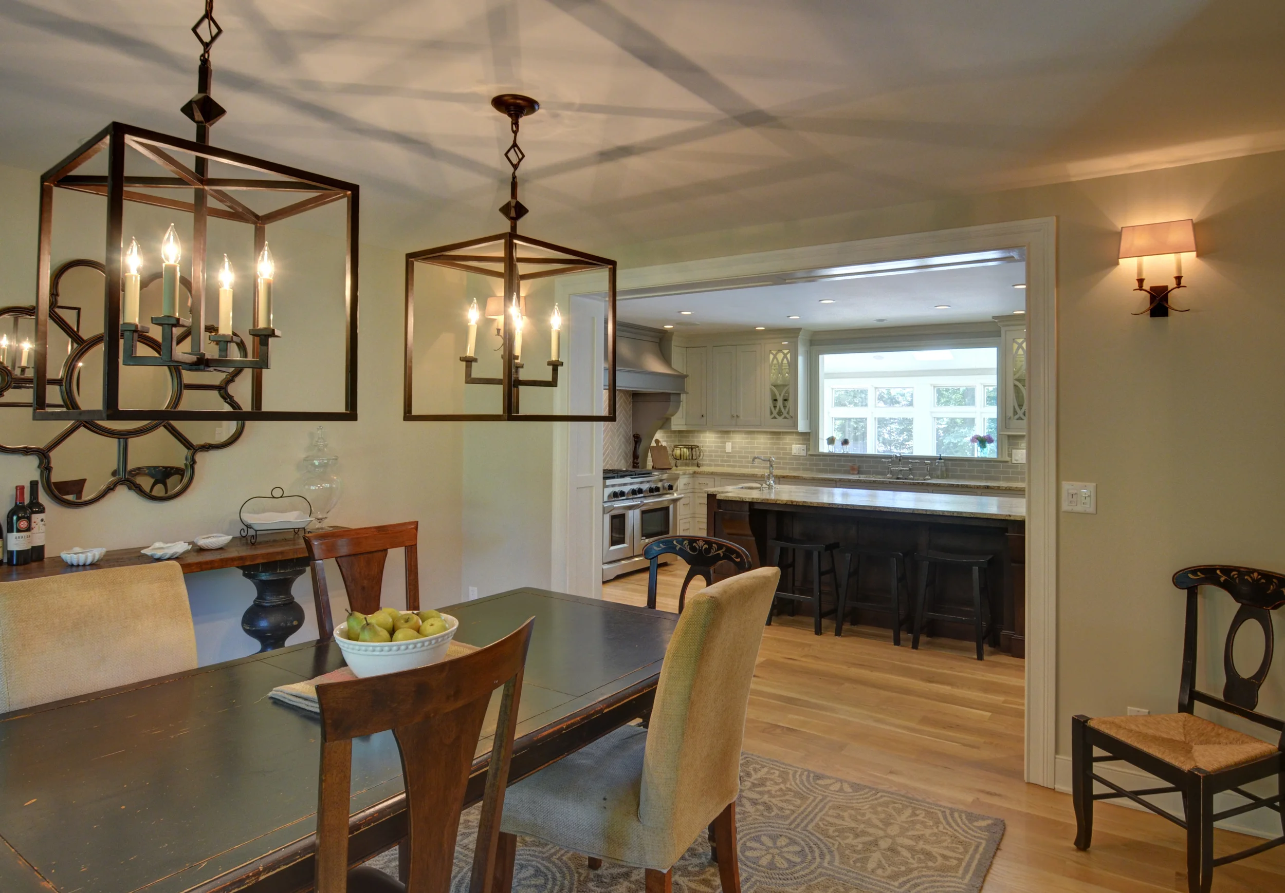
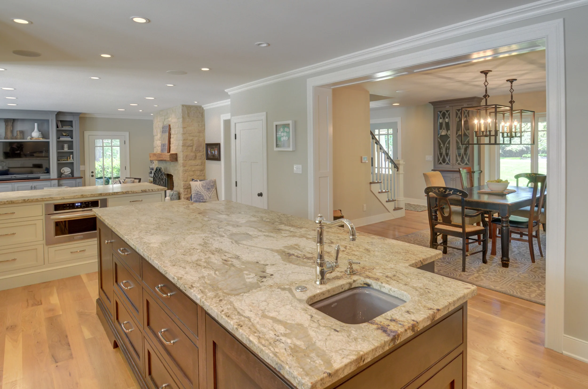
The old dining room was completely formal and separated from the kitchen. Instead of having a small breakfast area AND a dining room, we opened up the wall and made the dining room be both of those spaces.
Click HERE for the "Before" shot.
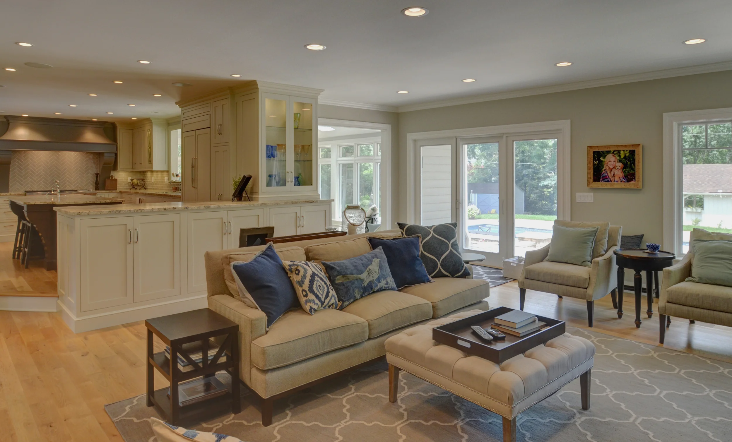
Opening the dining room and living room to the foyer help to create a circular pattern within the house and assist in visually connecting the spaces as well.
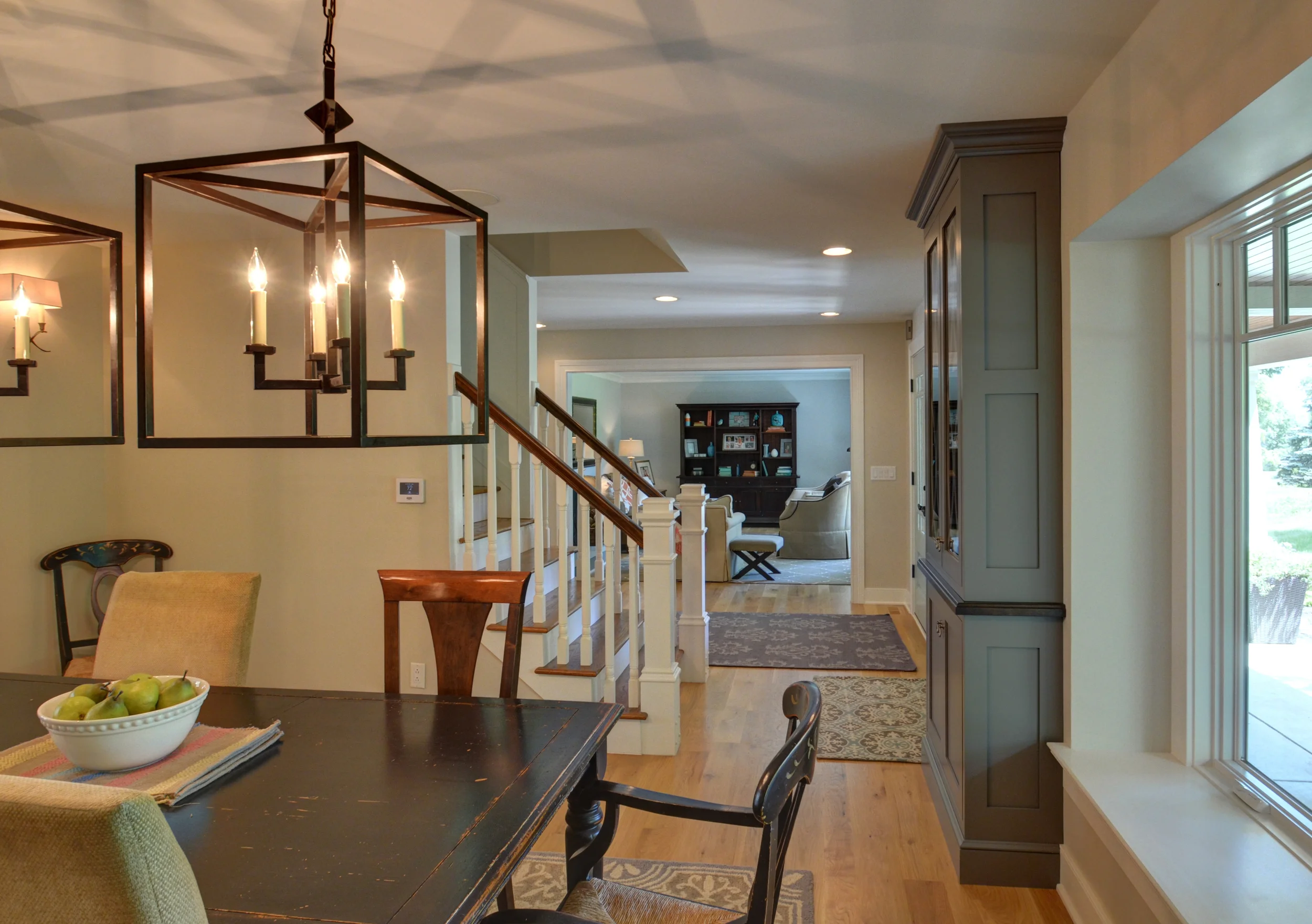
Everything is wide open, yet still "defined". Every space in this home has a purpose.
Click HERE for the "Before" shot.
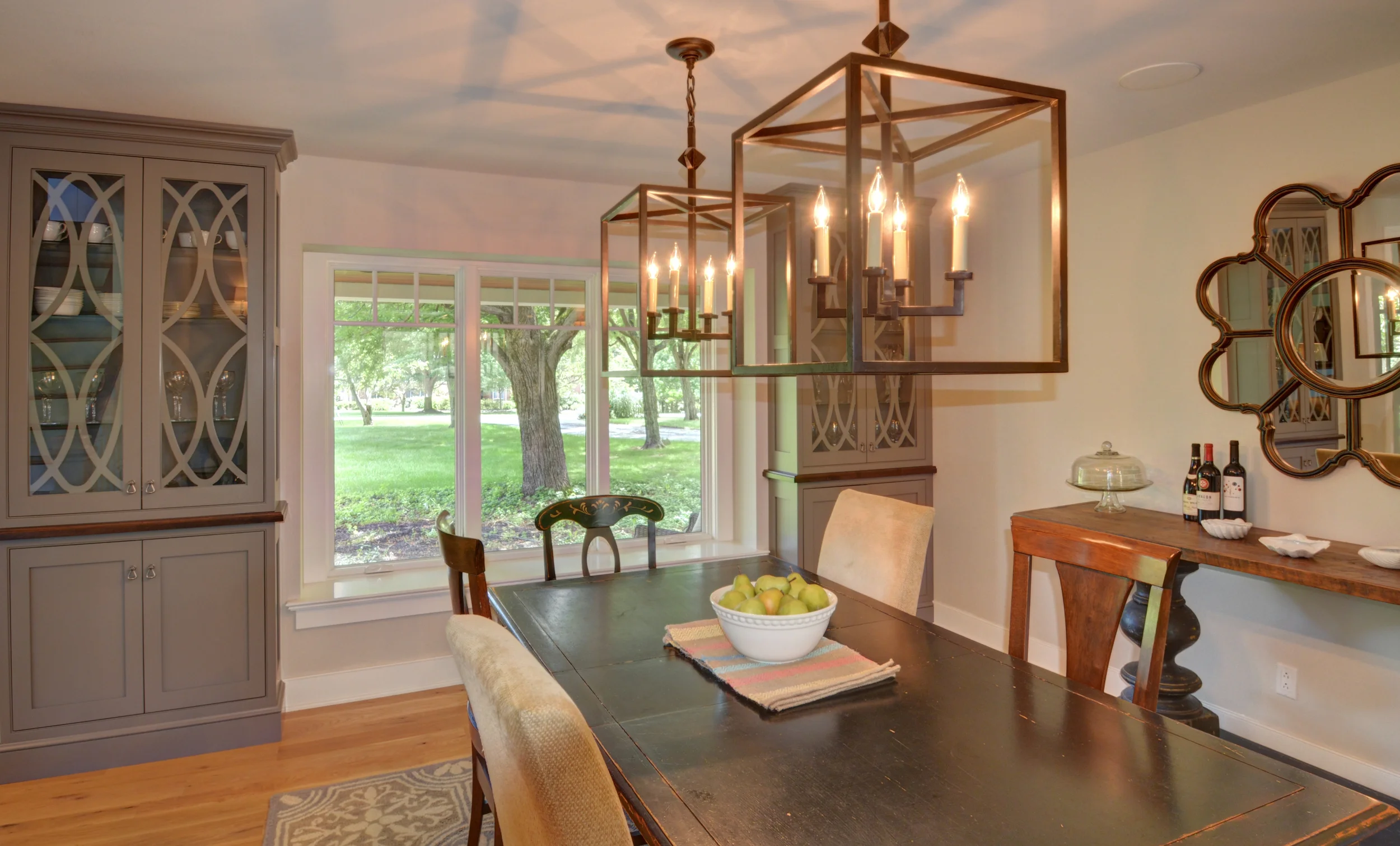
These cabinets help to visually tie the dining room back to the kitchen. They also help to "dress up" the dining room so that it's more than just a family eating area.
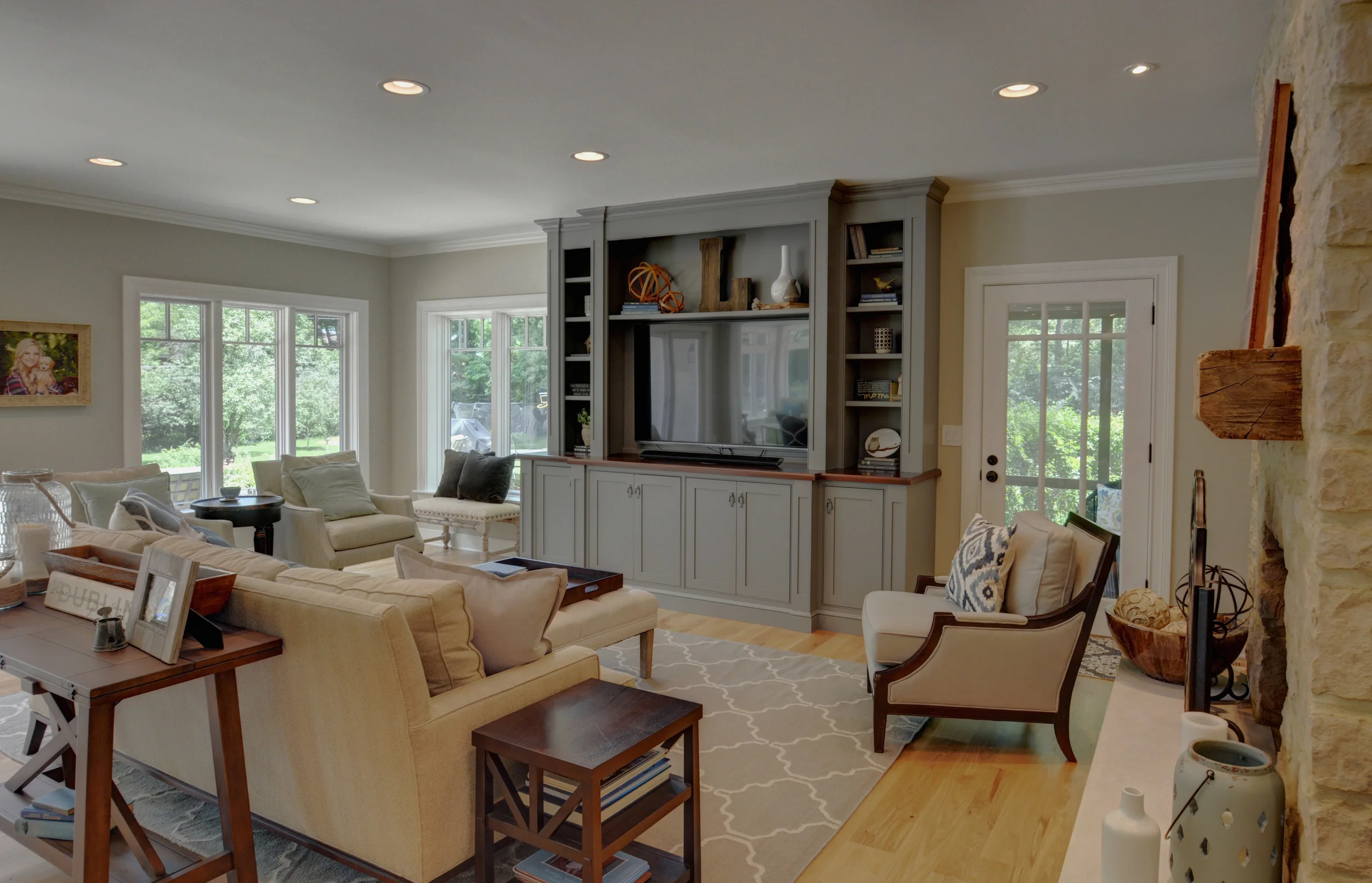
The end of this room used to be where the left of the media cabinets currently are. While this addition might be small, in some respects, it was absolutely perfect in creating the space we wanted for the furniture design. If we had added more space, it would have actually been too much!
Click HERE for the "Before" shot.
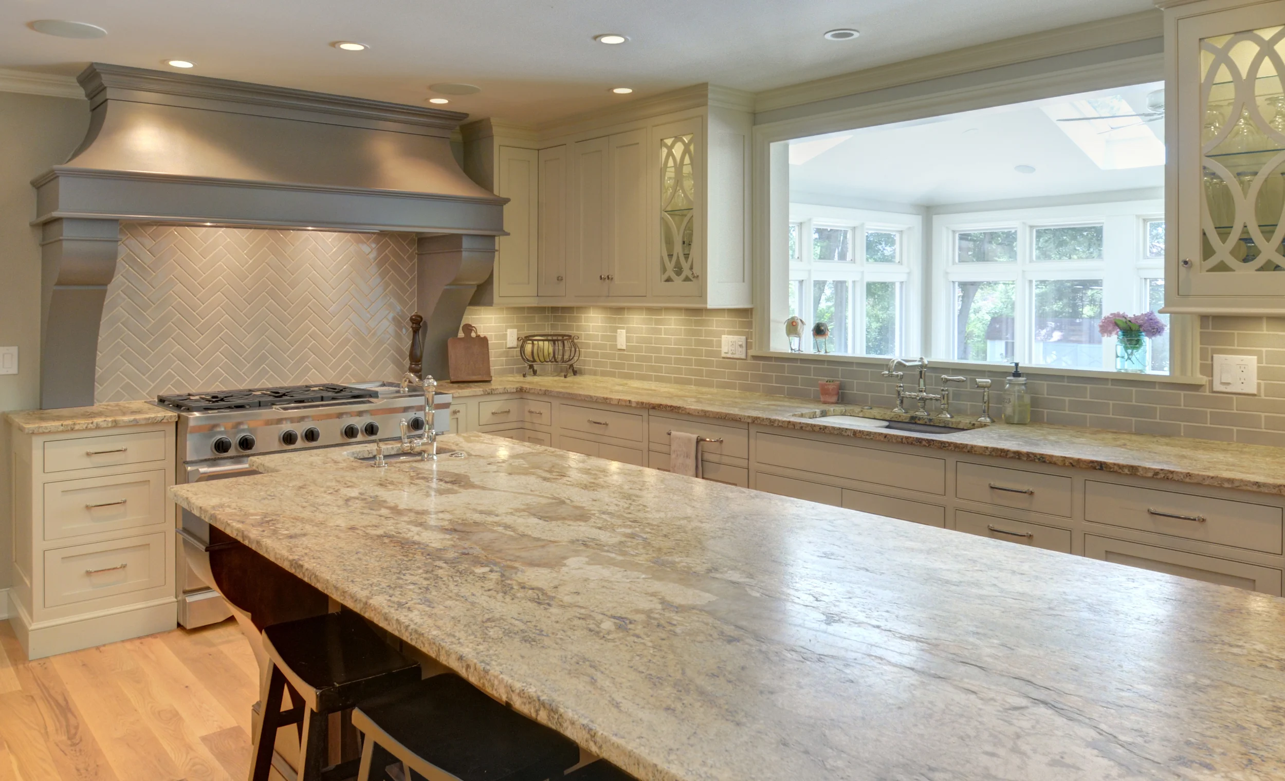
Again, from this view, the addition was created right beyond the kitchen cabinets. We located it so that we could also connect the rear sunroom to the main living space.
This home has been published in Columbus Monthly's 2017 Home & Garden Issue. Check it out here!